I'm not a designer, but for a brief period of time I got to feel like I knew how it feels to be one.
It all started when a new designer was brought on to a previous client project I worked on and introduced us to Zeplin. Or to be more precise I was given a link to a project in Zeplin and a piece of string[1].
After I spent some time with it I came to the conclusion that Zeplin lives somewhere between magic and Microsoft FrontPage, but in a good way.

You can either use Zeplin as a web app or install it on macOS or Windows.
For most of the project I had no need for anything but the web app. Keep reading to find out why I changed to the desktop app.[2]
We used Zeplin for a web app with HTML5 and CSS. It can also be used for iOS/Android development.
Why use Zeplin?
It allows designers to use the tools they normally use (I assume) and then communicate their intent using Zeplin instead of images or PDFs.
At the same time, it allows me, the developer, to quickly get the information I need about the design in a way that makes sense to me.
In my experience Zeplin greatly reduces the handover time between design and development, causing less friction.
1. Slack integration
We use Slack. I love Slack. Zeplin integrates with Slack.
If you use Slack, consider activating the integration, especially if you find it hard to keep up with what the designers are adding and changing.
2. Relative sizes
When clicking on something in Zeplin you get a list of properties for stuff like colors, font type and sizes.
In addition Zeplin draws distances to stuff around the thing you clicked. By default, it gives them as pixels for HTML.
This is handy, but most of the designs we use are based around relative sizes.
You could calculate this yourself using the information Zeplin gives you, but that would be slow and awkward.
Instead press the alt key after selecting something. All sizes are now magically percentages instead of pixels.

Sometimes Zeplin doesn't quite get the right element to use as parent. Press the up key to cycle through parent elements. Likewise, you could go back down using the down key.
3. Exporting assets
The designer can mark assets as exportable. This makes the asset downloadable as png and svg. Zeplin by default creates three sizes for the png.
I've spent more time waiting for icons than I'd like to admit. This removes some of that hurdle and even if it's a small thing it's a huge value add.
4. Pop out window
This is the reason I started using the desktop installation instead of the web app.
Click Alt + O and a semitransparent window pops out. Drag it over your web page and compare it with how it actually is supposed to look like.
Pop out is now available on the Windows app! Quickly compare your apps with the designs. Pop designs out using the button ↙️ or Alt+O. 🖼🔍 pic.twitter.com/2GA7M3MWwI
— Zeplin (@zeplin_io) February 7, 2017
It's awesome and heartbreaking at the same time. At least if your implementation of the design is... well, let's call it less than pixel perfect.
Bonus tip
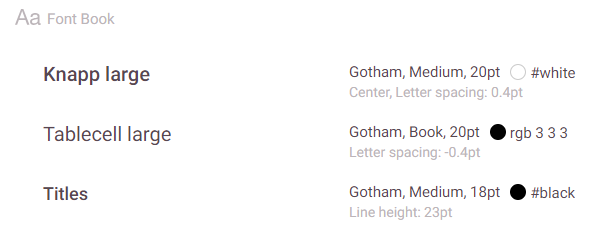
Press ALT+S to open the styleguide for easy access to Color Palette and Font Book with CSS for both.
The Color Palette has names for each of the colors and the correct color codes as CSS variables (no more opening the pdf the designer sent you and using the color picker in Paint.net!).

The Font Book is not as exiting, but useful nonetheless.

Conclusion
Zeplin is a tool that might be a great choice in your organization if you can get buy-in from the designers.
It greatly reduces the friction related to hand-offs between designers and developers.
And at least one developer had a brief experience of feeling how he imagines a designer feels when implementing a design in HTML and CSS.
Footnotes
This is a lie. I was never given a piece of string. ↩︎
If you skipped down here you've missed the part where I gave the reason for changing to the desktop app. I'll give you a hint, it's tip number 4. ↩︎

